
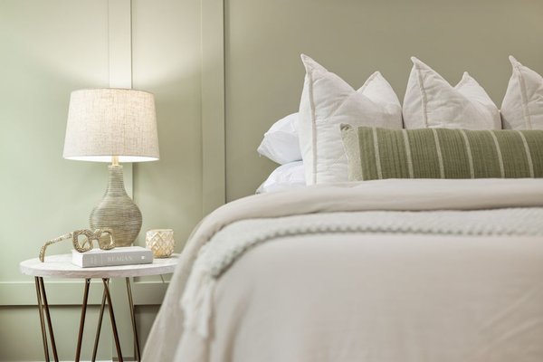
How do you choose pastel green paint colours that stay fresh?
Choose pastel green paint colours with a visible green undertone rather than a nearly white base. Test large samples in morning, afternoon, and lamplight. A slight yellow bias can keep north-facing walls from looking gray, while a restrained blue-green can suit sunny rooms. Pair the walls with defined white trim and natural wood.
Pastel green looks straightforward on a paint chip, then changes as soon as it covers four walls. Use this checklist to identify the undertone, select a room-appropriate finish, and check the result under the light you actually live with.
Which undertones make pastel green look fresh?
A pastel green stays recognizable when its green component remains visible against trim, flooring, and furniture. If the paint is only marginally different from white, shaded corners can erase its color. Check the chip beside the existing floor rather than against the paint-store’s white display.
Blue-leaning greens often appear cleaner in strong southern daylight, but can become cold in northern exposure. A gentle yellow-green cast brings some life to indirect northern light, though powerful afternoon sun can make that same undertone look creamy.
A pale starting point for a bright room
Sherwin-Williams Opaline SW 6189 is a starting sample when you want a barely colored wall that still reads green beside trim. Its approximate digital reference is #DCDFD7; match the physical paint chip rather than trusting a screen.
#DCDFD7 · Sherwin-Williams Opaline SW 6189
In north-facing light, it can read grayer and almost white; south-facing sunlight gives its gentle green cast more presence. Try it over roughly 60 percent of visible room surfaces.
A numbered checklist before you buy a gallon
- Check fixed surfaces: Put the chip against tile, flooring, countertops, and cabinets; never judge it against a blank wall alone.
- Move samples between walls: Inspect the window wall, the opposite wall, and the darkest corner.
- Watch three light conditions: Check shortly after sunrise, at midday, and under lamps after dark.
- Confirm visible green: Step back 8 ft; if the sample looks white, choose more discernible pigment.
- Review the finish: View it at an angle; sheen changes reflections and perceived undertones.
- Repeat beside trim: Hold the white sample against green to reveal whether the wall looks crisp or dull.
- Look again tomorrow: Recheck before purchasing, especially if the weather changes.
Readers comparing pale green paint colours should look beyond a chip’s brightness. The broader green paint colours guide can help narrow the family before you commit to a pastel shade.
Which pastel greens work in bedrooms, kitchens, and bathrooms?
Bedrooms can tolerate softer green because they are often viewed under gentler light. Kitchens need separation from cabinets, while bathrooms require sampling beside tile and under vanity lighting. Keep green on the walls first; full-room color drenching is harder to correct.
Bedroom: a clearer green for relaxed walls
Sherwin-Williams Sea Salt SW 6204, represented approximately by #CDD2CA, offers more visible green-gray character than the faintest pastels. In a bedroom, start with the main walls rather than painting the ceiling at the same time.
#CDD2CA · Sherwin-Williams Sea Salt SW 6204
North-facing daylight can pull it toward cool gray-green, while southern light makes the green easier to read. Reserve roughly 60 percent of visible room surfaces for this wall color.
Kitchen or bathroom: check permanent finishes
Benjamin Moore Healing Aloe 1562, with an approximate screen reference of #D5DBD2, is worth sampling where the goal is light green with a noticeable gray component. Put it beside the backsplash or vanity before choosing it for the entire wall.
#D5DBD2 · Benjamin Moore Healing Aloe 1562
In a north-facing space it may appear grayer; in south-facing light its green cast can become easier to detect. Use it on about 50 to 60 percent of visible surfaces, leaving the remainder for tile, cabinets, and trim.
Use a bathroom-rated paint product and the manufacturer’s recommended preparation for humidity. Paint cannot solve condensation or a leak; address the moisture problem first, with a qualified professional for plumbing or ventilation work.
For specialized room choices, see green bathroom paint colours; for a stronger gray-green appearance, the sage green paint colours guide is the closer starting point.
How do pastel greens react to north-facing light?
Northern exposure usually makes pale green feel cooler and grayer, sometimes flattening it almost to off-white. Southern exposure generally strengthens warmth and reveals yellow or green undertones. Compare the same sample in both conditions rather than judging from an online image.
| Room condition | North-facing appearance | South-facing appearance |
|---|---|---|
| Blue-green undertone | Can shift icy or gray in shade | Often reads clearer and visibly greener |
| Yellow-green undertone | May retain more green character | Can look more yellow by afternoon |
| Very low pigment | May disappear into near-white walls | Can wash out under direct sun |
| White trim boundary | Helps reveal subtle wall color | Can make wall green more apparent |
| Glossy surrounding tile | Cool reflections may dominate | Bright glare can hide differences |
These are likely visual shifts, not promises. A shaded south-facing window may receive less useful light than an unobstructed north-facing one. A sample at eye level reveals more than any thumbnail on your phone.
What whites and wood tones pair best with pastel green?
Choose a white that gives green a defined edge without a sharp blue cast. Wood grain adds definition where wall pigment is faint. Keep the scheme controlled: about 60 percent green walls, 30 percent white or existing finishes, and 10 percent wood and darker accents.
Sherwin-Williams Pure White SW 7005, approximately #EDECE6 digitally, is a practical trim sample beside the three greens above. Its slightly warm character can soften the transition to door frames and baseboards.
#EDECE6 · Sherwin-Williams Pure White SW 7005
North-facing light can make it appear cleaner and less creamy; south-facing light emphasizes its faint warmth. Use it for approximately 20 to 30 percent of the visible scheme, including trim and possibly the ceiling.
Natural white oak supplies recognizable grain instead of another competing painted surface. Sample green directly against the wood. In southern light the oak looks more golden and the wall greener; in northern light the wood can supply warmth while the wall moves cooler.
If shopping among light green paint colours, take cabinet and flooring samples with you. Two nearly identical pale painted surfaces can merge into one indistinct area at home.
Sample sizes, spacing, and viewing distance
A tiny chip cannot show how an undertone behaves across a wall. Use removable sample boards without marking rental surfaces, positioning each at a realistic viewing height beside the existing trim.
- Paint sample board 18 x 24 in
- Gap between sample boards 12 in
- Sample center height 57 in from the floor
- Distance for checking undertones 8 ft from the wall
- Trim sample strip 6 x 24 in
When does pastel green fail in a dark room or rental?
Pastel green is a poor bet when the room receives little daylight and you cannot improve the lighting. The palest samples often look like dirty white in a north-facing hallway, particularly beside gray flooring and cool LED bulbs. Painting every wall and the ceiling the same barely visible shade may look seamless in a staged photograph, but in ordinary evening light it can remove the contrast that gives the room shape. A filtered photograph cannot tell you how the color will behave at 7 p.m.
It also makes little sense to repaint a rental without written permission. Use removable boards to test; do not stick wet painted paper to the wall or assume a landlord will accept a changed color. In a kitchen with glossy tile or a bathroom with unstable humidity, a subtle green can be overwhelmed by reflections or moisture damage. A fresh coat cannot repair failing caulk, leaking pipes, or a ventilation problem.
If your samples never look distinctly green in the actual room, stop. A more saturated sample or a different scheme is a better decision than buying gallons of paint you already doubt.
Frequently asked questions
How large should a pastel green paint sample be?
Use an 18 x 24 in removable board or a comparably large manufacturer sample. Put it beside trim and flooring, then view it from at least 8 ft away in different lighting conditions.
Can pastel green walls make a small room feel larger?
They may make walls feel less visually demanding, but paint cannot increase the room’s dimensions. A pale green with no contrast can blur corners and make furniture look disconnected.
Should the ceiling match the green walls?
Keep the ceiling in the chosen trim white until wall samples are approved. A matching ceiling is harder to reverse and can make weak green seem less defined.
Is matte or eggshell easier to maintain?
Product formulations differ, so check the manufacturer’s cleaning guidance instead of relying on sheen alone. For kitchens and bathrooms, prioritize the paint’s stated suitability for that environment.
Can I judge the paint by a hex code?
No. Hex values are approximate digital references, while screens and paint reflect light differently. Confirm the physical chip and sample in your room before purchasing.
The best pastel green still looks green next to your flooring, trim, and furniture at the least flattering time of day. Sample first, check the light twice, and let the room make the decision.