
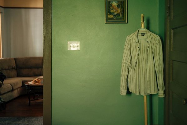
How can you paint light green colour without a cold-looking room?
To paint light green colour without making a room feel cold, start with a green that has a slight yellow undertone, test it on two walls, and pair it with a creamy white. Aim for roughly 65 percent green walls, 25 percent ceiling and trim, and 10 percent furniture or decorative accents.
A paint chip that looks inviting in a store can turn gray beside a north-facing window. Judge your green beside the actual floor, window light, and trim, not just against a white sample card.
Which undertones keep light green from looking cold?
A hint of yellow in pale green usually makes it feel more settled where daylight is cool. Strong blue undertones can work in sunny rooms but are harder to balance in rooms without direct sun.
Five ways to keep a pale green comfortable
- Check the undertone beside flooring: A sample that suits the existing floor is less likely to look icy across an entire wall.
- Test near the window and in a corner: The same color can look clear in daylight and gray where furniture casts shade.
- Keep trim deliberately creamy: A slightly warm white avoids an abrupt boundary that makes a gentle green seem blue-gray.
- Look after sunset: Room lamps matter as much as noon daylight when you actually spend evenings there.
- Use large surfaces as references: Cabinets, countertops, curtains, and sofas influence the result more than a tiny fan-deck chip.
Browse green paint colours to shortlist undertones, but use physical samples before ordering gallons. A phone screen is not an accurate substitute.
Three real light-green paints to sample
Sherwin-Williams Liveable Green SW 6176, displayed digitally as #CECEBD, has a restrained yellow-green tendency. It is a sensible first sample where the daylight already feels cool, although the room itself must decide.
#CECEBD · Sherwin-Williams Liveable Green SW 6176
North-facing light can make it grayer; south-facing sun brings out its yellow cast. Use it on roughly 65 percent of visible surfaces.
Sherwin-Williams Filmy Green SW 6190, shown as #D1D3C7, is a restrained alternative for someone wanting less obvious green. Hold the sample beside baseboards before assuming it will read green from the doorway.
#D1D3C7 · Sherwin-Williams Filmy Green SW 6190
North-facing daylight can make this almost gray; southern light reveals its yellow-green character. Give it approximately 60 to 65 percent of visible surfaces.
Sherwin-Williams Sea Salt SW 6204, shown as #CDD2CA, is worth testing in a genuinely sunny room. Its gray-green undertone can become pronounced in cool daylight, so avoid choosing it from a bright listing photograph.
#CDD2CA · Sherwin-Williams Sea Salt SW 6204
North-facing light emphasizes gray; south-facing light makes its green clearer. Limit it to about 60 percent of visible surfaces where extra balance is needed.
Hex codes describe digital reference colors, not guaranteed results on drywall. Buy physical samples in your intended finish; light green colour paint changes with wall texture, bulbs, and exposure.
How does light green change in north-facing versus south-facing rooms?
North-facing daylight tends to make light green cooler and grayer, while south-facing daylight generally warms it. Inspect the same patch in morning and afternoon before judging whether the color feels balanced.
A north-facing room is not automatically unsuitable for green, but a barely green shade can disappear into gray in its darkest hours. South-facing windows can make its undertones look stronger.
| Room condition | North-facing light | South-facing light |
|---|---|---|
| Yellow-leaning pale green | Reads more subdued and gray | Yellow tendency becomes more visible |
| Blue-leaning pale green | Can read chilly or silvery | Often looks clearer in direct sun |
| Patch in a shaded corner | Can appear noticeably deeper | Contrasts with nearby sunlit wall |
| Patch beside creamy trim | Boundary looks less stark | Trim may appear more yellow |
Test during usual daylight and with your everyday lamps switched on. If the paint works only for a few minutes around noon, it probably is not a reliable whole-room choice. You could also sample sage green paint colours, provided you judge them in the actual room.
Which whites and woods pair cleanly with light green?
A creamy white and visible wood grain can prevent pale green from feeling clinical. Sample the white beside the green first, then hold actual wood or cabinet samples against both finishes.
Sherwin-Williams Alabaster SW 7008, displayed as #EDEAE0, is a useful trim and ceiling candidate. Its gentle warmth can keep the boundary from appearing harsh, but a painted test strip is still essential.
#EDEAE0 · Sherwin-Williams Alabaster SW 7008
North-facing light can flatten its creaminess; south-facing sun emphasizes warmth. Reserve roughly 25 percent of the visible room for this ceiling and trim shade.
Species, stains, and topcoats all affect how wood looks beside green. Use a flooring offcut or cabinet door rather than relying on a retail photograph.
| Wood or surface | North-facing pairing | South-facing pairing |
|---|---|---|
| Clear-finished white oak | Grain adds welcome warmth | Golden cast may be stronger |
| Clear-finished walnut | Dark grain gives definition | Contrast looks richer in sun |
| Glossy white cabinet fronts | Reflections can amplify coolness | Glare can distract from walls |
| Low-sheen painted trim | Provides a steadier edge | Limits reflected highlights |
Existing stained cabinets should remain part of your test rather than something you try to ignore. Related light green paint colours can help narrow the search, but the room’s permanent finishes should have the final vote.
What wall and trim proportions make light green feel balanced?
Start with about 65 percent green walls, 25 percent ceiling and painted trim, and 10 percent furniture or accents. Those are shares of what you see from the doorway, not a formula for gallons.
In a 12 x 15 ft room with an 8 ft ceiling, the wall area before subtracting openings is approximately 432 square feet. Visual balance also includes floors, windows, and furniture, so do not count wall area alone.
Repeat the ceiling shade on baseboards and doors so it does not look isolated overhead. If cabinets occupy half a wall, count them in the overall visual balance.
- Paint patch on each wall 24 x 24 in
- Patch from nearest corner 12 in
- Trim-color test band 6 in wide
- Distance for viewing a sample 6 ft
Place samples on clean, prepared surfaces and inspect them from the doorway as well as close up. For a glossy or dark existing wall, appropriate primer may be needed before a realistic test. Renters should obtain written permission before repainting.
When does pale green paint fail to make a room feel inviting?
It fails when there is too little usable light to reveal the green, when existing flooring clashes with it, or when the shade looked attractive only in a bright online photograph. A north-facing basement bedroom with one small window will not become sunny because its walls are pale green. The camera’s exposure in a styled room may be doing most of the work.
It also fails when reflective cabinet fronts, a glossy ceiling, and cool bulbs all pull the room in the same direction. Painting directly over stains, damage, or a slick finish without suitable preparation can leave uneven coverage. Buying a different green will not repair an unsuitable surface or solve moisture damage.
On a tight budget, buy samples before full gallons. In a rental without permission to repaint, leave permanent surfaces alone and change only the furnishings you are allowed to move. If fixed countertops and floors disagree with every green sample, abandon the scheme rather than force it. Some beautiful pale-green rooms work only in photographs, especially when the pictures hide their dark corners and conflicting finishes.
Frequently asked questions
Should I paint the ceiling green too?
Begin with a creamy-white ceiling and green walls. A green ceiling changes the visual proportions and requires its own full-size test.
Is matte or eggshell better for green walls?
Matte can conceal minor wall flaws, while eggshell is often easier to wipe clean. Follow the cleaning advice for the exact paint product you purchase.
Can I choose from a paper color chip?
Use a chip for shortlisting, not final approval. A 24 x 24 in patch on two walls will reveal much more about light and shadow.
What if my room relies on artificial light?
Check samples under the lamps used every evening. Bulb temperature, lampshades, and reflected light affect how green reads.
How do I stop the finished room looking too green?
Keep green within the planned wall share and let trim, wood, and furnishings remain visible. Stand in the doorway before adding painted furniture or another accent wall.
A pleasing light green survives ordinary daylight, evening lamps, and the finishes already in place. Choose the sample that still looks good on a dull afternoon, not the one that only shines in a photograph.