
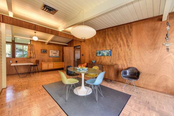
A mid-century modern color palette does more than add a retro note to a room. It creates the warmth, contrast, and rhythm that make this style instantly recognisable. The strongest schemes balance earthy neutrals with one or two confident accents, drawing colour from timber, ceramics, upholstery, and graphic art rather than relying on wall paint alone.
Classic mid century modern colors include mustard, olive, burnt orange, teal, walnut brown, cream, and charcoal. The key is restraint: choose one dominant shade, one supporting colour, and a smaller accent. The 12 combinations below offer different moods while staying true to the clean lines and natural materials associated with the period.
12 Timeless Mid-Century Modern Color Combinations
1. Mustard Yellow, Teal, and Warm White
A mustard and teal palette is one of the most recognisable retro color schemes, yet it looks fresh against warm white. Use ivory or soft cream on walls, teal on a sofa or cabinet, and mustard on an armchair, cushions, or artwork. Walnut furniture links the saturated shades and keeps the room grounded.
2. Olive Green, Walnut Brown, and Cream
Olive and walnut share an earthy depth, making this palette ideal for calm living rooms, studies, and bedrooms. Try olive on one wall or a large upholstered piece, cream on the remaining surfaces, and walnut in tables or shelving. Brass lighting adds warmth without becoming another dominant colour.
3. Burnt Orange, Camel, and Charcoal
Burnt orange brings energy, camel softens it, and charcoal adds structure. Anchor the room with a camel leather sofa, introduce orange through textiles or a statement chair, and reserve charcoal for slim furniture legs, frames, or a rug pattern. Limiting the darkest shade prevents the space from feeling heavy.
4. Avocado Green, Ochre, and Natural Wood
Avocado can feel overly nostalgic unless the surrounding colours are quiet. Pair it with muted ochre and oak, teak, or walnut. In a dining room, avocado chairs around a wooden table could be balanced by an ochre pendant or framed print. Neutral walls let the furniture carry the colour story.
5. Deep Teal, Rust, and Soft Grey
Deep teal and rust create rich contrast without the sharpness of pure blue and orange. Soft grey gives both colours breathing room. Use teal on cabinetry or a feature wall, rust in upholstery, and grey across larger surfaces. This suits anyone seeking MCM paint colors that feel dramatic but still liveable.
6. Dusty Rose, Burgundy, and Walnut
Mid-century interiors were not limited to greens and oranges. Dusty rose with burgundy creates a softer, sophisticated variation, while walnut adds depth. Consider a dusty rose wall, burgundy velvet chair, and walnut sideboard in a bedroom or reading corner. Cream accents will keep the reds from dominating.
7. Navy Blue, Cognac, and Brass
Navy provides an architectural backdrop, cognac leather adds warmth, and brass supplies a restrained glow. Use navy on shelving or one wall, then soften it with a cognac sofa, teak desk, or leather dining chairs. Keep brass to lamps, handles, and one or two sculptural details.
8. Sage Green, Terracotta, and Sand
Sage, terracotta, and sand create a relaxed version of mid-century style and work well in smaller rooms. Let sand cover the walls, use sage on upholstery or cabinetry, and add terracotta through pottery, cushions, or a rug. The result feels warm and organic while still referencing classic retro color schemes.
9. Turquoise, Coral, and Pale Oak
Turquoise and coral bring playfulness, while pale oak provides balance. Choose muted versions rather than tropical brights. A turquoise chair, coral artwork, and pale oak desk can enliven a breakfast nook or home office without overwhelming it. White walls and simple shapes keep the combination crisp.
10. Chocolate Brown, Cream, and Tomato Red
Chocolate brown and cream form a dependable neutral base, while tomato red delivers graphic punch. Use red sparingly in a chair, pendant shade, or geometric print. Brown can appear in timber, leather, or a rug, while cream keeps the room open. This palette is useful for cautious colour users.
11. Plum, Mustard, and Mushroom
Plum and mustard make an unexpected but period-appropriate pairing. Mushroom beige moderates both and gives the room a sophisticated foundation. Use mushroom on walls, plum on a sofa or headboard, and mustard in smaller accents. Deep, softened versions look more elegant than two equally bright shades.
12. Black, Warm White, and Teak
Not every mid-century modern color palette needs vivid accents. Black, warm white, and teak emphasise silhouette and craftsmanship. Use warm white for the room envelope, teak for principal furniture, and black for lighting, frames, chair legs, or a geometric rug. It is especially effective across open-plan spaces.
How to Choose the Right Palette
Begin with fixed elements you cannot easily replace, such as flooring, stone, cabinetry, or a large sofa. Choose colours that complement their undertones. Warm timber usually pairs well with creamy neutrals and muted jewel tones, while cooler flooring may benefit from rust, mustard, or cognac.
Before buying paint, place a timber sample, fabric swatches, and two large painted cards together near the window. Check them in morning light, afternoon light, and under lamps. This practical test often reveals whether a teal looks too blue, an olive too grey, or a cream too yellow.
Natural internal-link opportunities include mid-century modern living room ideas, choosing statement lighting, and mixing vintage and modern furniture.
Frequently asked questions
What are the most authentic mid century modern colors?
Common choices include mustard, olive, avocado, burnt orange, teal, rust, walnut brown, cream, charcoal, and muted blue. Authenticity comes from balancing them with timber and simple forms, not using every recognised shade at once.
Can this palette work in a small room?
Yes. Keep the largest surfaces light, choose one medium-strength colour for furniture or cabinetry, and reserve the darkest or brightest shade for small accents. This preserves openness while giving the room a clear identity.
Should every room use the same palette?
No, but repeating one neutral, timber tone, or accent colour creates continuity. Teal, for example, might appear prominently in the living room and return subtly in artwork elsewhere.
Which paint finish suits the style?
Matt or low-sheen finishes suit walls because they create a soft appearance. Satin works well on cabinetry and woodwork where durability matters, while high gloss is best limited to deliberate details.
A Balanced Retro Look That Lasts
The best palette feels collected rather than copied. Start with warm neutrals and natural wood, add one defining colour, then introduce a contrasting accent with discipline. From earthy olive and walnut to graphic black, white, and teak, good proportions make the scheme timeless, comfortable, and connected to the room.